CSS Standard
Gurted implements a utility-first CSS approach similar to Tailwind CSS, but rendered natively through Flumi. This allows for rapid styling without writing custom CSS rules while maintaining native performance.
CSS Integration
CSS can be included in Gurted documents through multiple methods:
<head>
    <!-- Inline styles in head -->
    <style>
        h1 { text-[#ff0000] font-italic hover:text-[#00ff00] }
        p { text-[#333333] text-2xl }
        button { hover:bg-[#FF6B35] hover:text-[#FFFFFF] active:bg-[#CC5429] }
    </style>

    <!-- External stylesheet -->
    <style src="styles.css">
</head>

<body>
    <!-- Inline styles on elements -->
    <div style="flex flex-col gap-4 p-4 bg-[#f8fafc] rounded">
        <h1 style="text-3xl font-bold text-center">Styled Content</h1>
    </div>
</body>
Typography
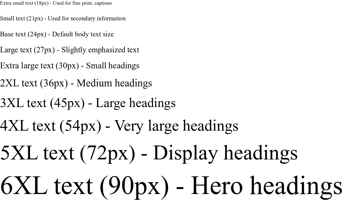
Font Sizes
Gurted uses a progressive font scaling system where each size corresponds to specific pixel values:
<p style="text-xs">Extra small text (18px) - Used for fine print, captions</p>
<p style="text-sm">Small text (21px) - Used for secondary information</p>
<p style="text-base">Base text (24px) - Default body text size</p>
<p style="text-lg">Large text (27px) - Slightly emphasized text</p>
<p style="text-xl">Extra large text (30px) - Small headings</p>
<p style="text-2xl">2XL text (36px) - Medium headings</p>
<p style="text-3xl">3XL text (45px) - Large headings</p>
<p style="text-4xl">4XL text (54px) - Very large headings</p>
<p style="text-5xl">5XL text (72px) - Display headings</p>
<p style="text-6xl">6XL text (90px) - Hero headings</p>
Flumi, being made in Godot, handles pixel sizes different. 24px in font size is the equivalent of 16px in standard browsers.
How to choose font sizes:
text-xstotext-sm: Secondary content, labels, captionstext-basetotext-lg: Body text and paragraphstext-xltotext-2xl: Subheadingstext-3xltotext-6xl: Main headings and titles
Utilities have been set to mimic real browser font sizes, which is why text-6xl will likely look similar in Flumi and Tailwind.
Font Families
Font families control the typeface used for text. Each has different characteristics:
<p style="font-sans">Sans-serif font (default) - Clean, modern appearance without decorative strokes</p>
<p style="font-serif">Serif font - Traditional typeface with decorative strokes, good for formal documents</p>
<p style="font-mono">Monospace font - Each character takes the same width, ideal for code</p>
<p style="font-roboto">Custom web font (requires <font> declaration) - External font loaded from web</p>
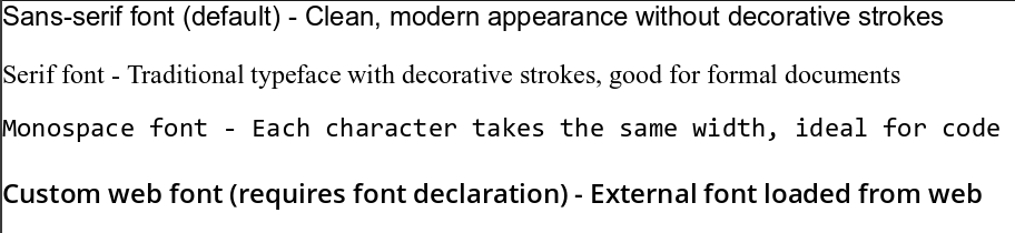
Flumi uses the system fonts for its built-in font families. This means the appearance of fonts such as monospace, serif, and sans-serif will match how they are rendered by your operating system, similar to standard web browsers.
Font characteristics:
- Sans-serif: Clean, readable on screens, modern feel
- Serif: Traditional, formal, good for printed text
- Monospace: Fixed-width characters, perfect for code and data tables
Custom fonts must be declared in the document head before use:
<head>
    <font name="roboto" src="https://fonts.gstatic.com/.../roboto.woff2" />
    <style>
        body { font-roboto }
    </style>
</head>
The name attribute is used to reference the font in styles. The weight attribute can be used to specify the font weight.
<font name="roboto" src="https://fonts.gstatic.com/.../roboto.woff2" weight="400" />
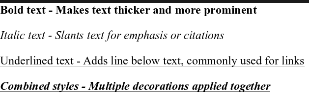
Font Styling
Text decoration and weight control visual emphasis:
<p style="font-bold">Bold text - Makes text thicker and more prominent</p>
<p style="font-italic">Italic text - Slants text for emphasis or citations</p>
<p style="underline">Underlined text - Adds line below text, commonly used for links</p>
<p style="font-bold font-italic underline">Combined styles - Multiple decorations applied together</p>
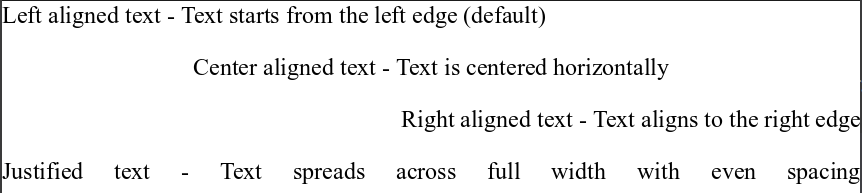
Text Alignment
Controls how text is positioned within its container:
<p style="text-left">Left aligned text - Text starts from the left edge (default)</p>
<p style="text-center">Center aligned text - Text is centered horizontally</p>
<p style="text-right">Right aligned text - Text aligns to the right edge</p>
<p style="text-justify">Justified text - Text spreads across full width with even spacing</p>
Colors
Understanding Color Systems
Gurted supports two color systems: hex and RGB values for precise colors and predefined colors for consistency.
Hex Colors use # followed by 6 characters (0-9, A-F) representing Red, Green, Blue values:
#ff0000= Pure red (ff=255 red, 00=0 green, 00=0 blue)#00ff00= Pure green#0000ff= Pure blue#ffffff= White (maximum all colors)#000000= Black (no color)
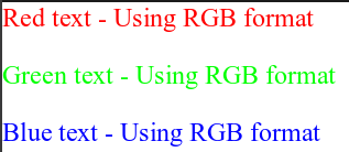
RGB Colors use rgb(r, g, b) format where r, g, b are values from 0 to 255:
<p style="text(rgb(255, 0, 0))">Red text - Using RGB format</p>
<p style="text(rgb(0, 255, 0))">Green text - Using RGB format</p>
<p style="text(rgb(0, 0, 255))">Blue text - Using RGB format</p>
rgba(r, g, b, a) is also supported, where a is the alpha channel for transparency (0-1 range)
Text Colors
Control the color of text content:
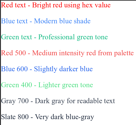
<!-- Custom hex colors - Use brackets for exact color values -->
<p style="text-[#ff0000]">Red text - Bright red using hex value</p>
<p style="text-[#3b82f6]">Blue text - Modern blue shade</p>
<p style="text-[#10b981]">Green text - Professional green tone</p>

<!-- Predefined color palette - Color name + intensity number -->
<p style="text-red-500">Red 500 - Medium intensity red from palette</p>
<p style="text-blue-600">Blue 600 - Slightly darker blue</p>
<p style="text-green-400">Green 400 - Lighter green tone</p>
<p style="text-gray-700">Gray 700 - Dark gray for readable text</p>
<p style="text-slate-800">Slate 800 - Very dark blue-gray</p>
Background Colors
Same color system applies to element backgrounds:
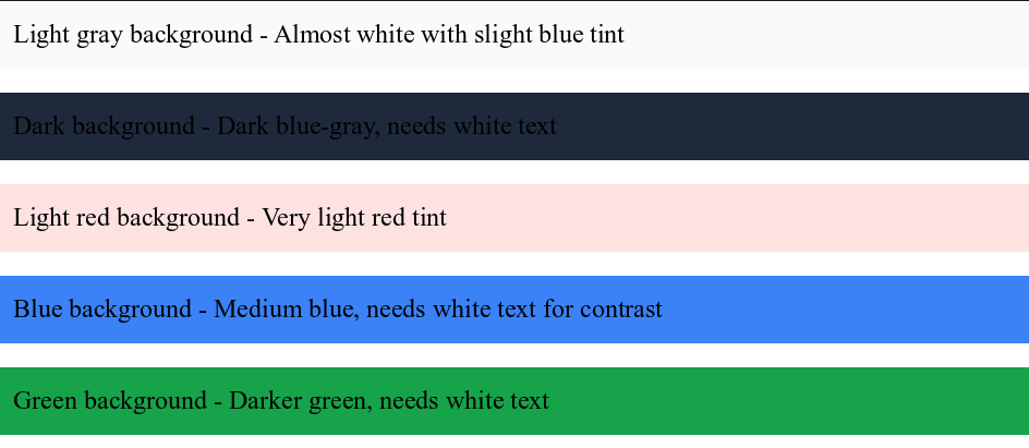
<!-- Custom hex backgrounds -->
<div style="bg-[#f8fafc] p-4">Light gray background - Almost white with slight blue tint</div>
<div style="bg-[#1e293b] text-white p-4">Dark background - Dark blue-gray, needs white text</div>

<!-- Predefined backgrounds -->
<div style="bg-red-100 p-4">Light red background - Very light red tint</div>
<div style="bg-blue-500 text-white p-4">Blue background - Medium blue, needs white text for contrast</div>
<div style="bg-green-600 text-white p-4">Green background - Darker green, needs white text</div>
Available Colors
Colors are formed by their name and their shade, example: text-red-500 or bg-blue-300.
Color shade scale (50-950):
- 50-200: Very light tints, good for backgrounds
- 300-400: Light colors, good for subtle accents
- 500-600: Medium colors, good for primary elements
- 700-800: Dark colors, good for text and emphasis
- 900-950: Very dark colors, good for strong contrast
These are directly taken from Tailwind CSS.
| Color | 50 | 100 | 200 | 300 | 400 | 500 | 600 | 700 | 800 | 900 | 950 |
|---|---|---|---|---|---|---|---|---|---|---|---|
| Red | |||||||||||
| Orange | |||||||||||
| Amber | |||||||||||
| Yellow | |||||||||||
| Lime | |||||||||||
| Green | |||||||||||
| Emerald | |||||||||||
| Teal | |||||||||||
| Cyan | |||||||||||
| Sky | |||||||||||
| Blue | |||||||||||
| Indigo | |||||||||||
| Violet | |||||||||||
| Purple | |||||||||||
| Fuchsia | |||||||||||
| Pink | |||||||||||
| Rose | |||||||||||
| Slate | |||||||||||
| Gray | |||||||||||
| Zinc | |||||||||||
| Neutral | |||||||||||
| Stone |
Layout & Sizing
Understanding the Spacing System
Gurted uses a consistent spacing scale where each number represents 4 pixels:
1= 4px2= 8px4= 16px8= 32px16= 64px
Dimensions
Control the width and height of elements:
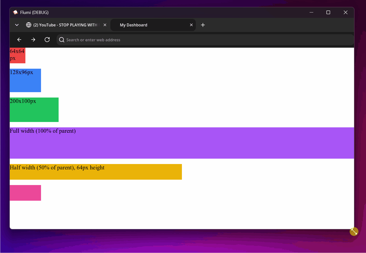
<!-- Fixed sizes using the spacing scale -->
<div style="w-16 h-16 bg-red-500">64x64px</div>
<div style="w-32 h-24 bg-blue-500">128x96px</div>

<!-- Custom pixel values using brackets -->
<div style="w-[200px] h-[100px] bg-green-500">200x100px</div>

<!-- Relative sizes as fractions of parent container -->
<div style="w-full h-32 bg-purple-500">Full width (100% of parent)</div>
<div style="w-1/2 h-16 bg-yellow-500">Half width (50% of parent), 64px height</div>

<!-- Min/max constraints to control sizing limits -->
<div style="min-w-32 max-w-64 min-h-16 max-h-32 bg-pink-500"></div>
Common width values:
w-full: 100% of parent widthw-1/2: 50% of parent widthw-1/3: 33.33% of parent widthw-1/4: 25% of parent widthw-auto: Natural width based on content
Spacing System Explained
- Padding adds space inside an element (between border and content)
- Margin adds space outside an element (between border and other elements)
<!-- Padding (internal spacing) -->
<div style="p-4 bg-gray-200">Padding all sides (16px) - Space inside the gray area</div>
<div style="px-6 py-2 bg-gray-300">Horizontal 24px, vertical 8px - Different spacing for x/y axes</div>
<div style="pt-4 pr-3 pb-2 pl-1 bg-gray-400">Individual sides: top-16px, right-12px, bottom-8px, left-4px</div>

<!-- Margin (external spacing) -->
<div style="m-4 bg-red-200">Margin all sides (16px) - Space around the red area</div>
<div style="mt-6 mb-4 bg-green-200">Top 24px, bottom 16px margin - Vertical spacing only</div>

<!-- Custom spacing using exact pixel values -->
<div style="p-[20px] m-[10px] bg-yellow-200">Custom 20px padding, 10px margin</div>
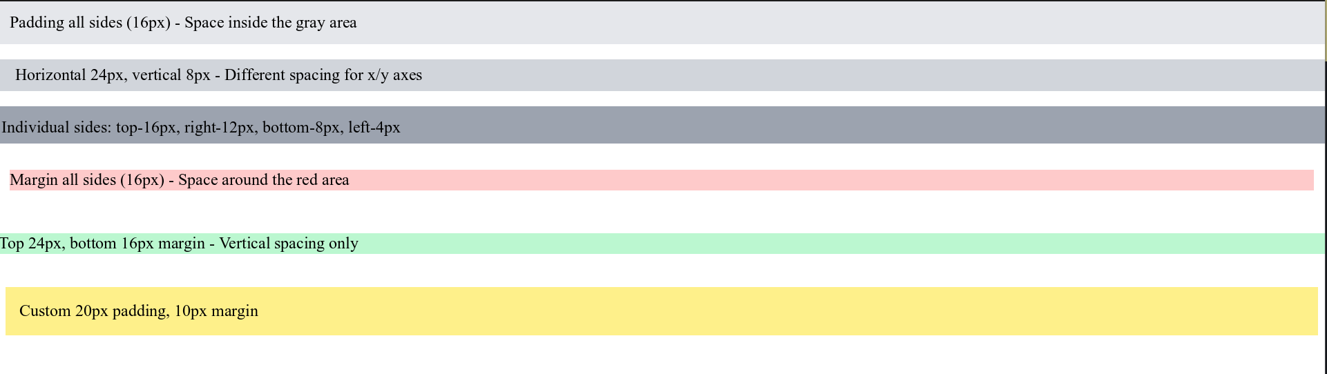
Spacing direction shortcuts:
p= padding all sidespx= padding left and right (x-axis)py= padding top and bottom (y-axis)pt= padding top onlypr= padding right onlypb= padding bottom onlypl= padding left only- Same pattern applies to margins with
mprefix
Flexbox System
Flexbox is a layout system that arranges elements in flexible containers. Think of it as a smart way to organize items in rows or columns with automatic spacing and alignment.
Flumi implements browser-grade CSS Flexbox support through Yoga layout engine
Container Properties
First, create a flex container to enable flexible layout:
<div style="flex">Basic flex container - Arranges children in a row by default</div>
<div style="inline-flex">Inline flex container - Acts like inline element but with flex children</div>
Direction & Wrap
Control how items flow within the container:
<!-- Direction controls the main axis (primary direction) -->
<div style="flex flex-row">Horizontal layout (default) - Items arranged left to right</div>
<div style="flex flex-row-reverse">Reverse horizontal - Items arranged right to left</div>
<div style="flex flex-col">Vertical layout - Items arranged top to bottom</div>
<div style="flex flex-col-reverse">Reverse vertical - Items arranged bottom to top</div>

<!-- Wrapping controls what happens when items don't fit -->
<div style="flex flex-wrap">Allow wrapping - Items move to next line when container is full</div>
<div style="flex flex-nowrap">No wrapping (default) - Items shrink to fit on one line</div>
<div style="flex flex-wrap-reverse">Reverse wrap - New lines appear above/before previous lines</div>
Alignment System Explained
Flexbox has two axes:
- Main axis: The primary direction (horizontal for row, vertical for column)
- Cross axis: The perpendicular direction (vertical for row, horizontal for column)
Justify (main axis alignment):
<div style="flex justify-start">Start alignment - Items packed at the beginning (default)</div>
<div style="flex justify-end">End alignment - Items packed at the end</div>
<div style="flex justify-center">Center alignment - Items packed in the center</div>
<div style="flex justify-between">Space between - First item at start, last at end, equal space between</div>
<div style="flex justify-around">Space around - Equal space around each item</div>
<div style="flex justify-evenly">Even space - Perfectly equal space between all items</div>
Align (cross axis alignment):
<div style="flex items-start">Start cross-axis - Items aligned to start of cross axis</div>
<div style="flex items-end">End cross-axis - Items aligned to end of cross axis</div>
<div style="flex items-center">Center cross-axis - Items centered on cross axis</div>
<div style="flex items-baseline">Baseline alignment - Items aligned by their text baseline</div>
<div style="flex items-stretch">Stretch items (default) - Items stretch to fill cross axis</div>
Gap & Spacing
Control spacing between flex items without using margins:
<div style="flex gap-2">8px gap between items - Consistent spacing (2 × 4px = 8px)</div>
<div style="flex gap-4">16px gap between items - Larger spacing (4 × 4px = 16px)</div>
<div style="flex gap-[12px]">Custom 12px gap - Exact pixel spacing</div>

<!-- Directional gaps for precise control -->
<div style="flex flex-col row-gap-2 col-gap-4">Row gap 8px, column gap 16px - Different spacing for each direction</div>
Item Properties
Control individual flex item behavior within containers:
<div style="flex">
    <div style="flex-grow-1">Grows to fill space - Takes available space (factor of 1)</div>
    <div style="flex-grow-2">Grows twice as much - Takes twice as much space as flex-grow-1</div>
    <div style="flex-shrink-0">Never shrinks - Maintains minimum size even when space is tight</div>
</div>

<div style="flex">
    <div style="basis-32">Fixed 128px basis - Preferred size before growing/shrinking</div>
    <div style="basis-[200px]">Custom 200px basis - Exact preferred size</div>
</div>

<!-- Self alignment overrides container's items-* setting -->
<div style="flex h-24">
    <div style="self-start">Align to start - This item ignores container alignment</div>
    <div style="self-center">Align to center - This item centers itself</div>
    <div style="self-end">Align to end - This item aligns to end</div>
    <div style="self-stretch">Stretch to fill - This item stretches regardless of container setting</div>
</div>

<!-- Display order changes visual order without changing HTML -->
<div style="flex">
    <div style="order-3">Third in visual order - Appears last despite being first in HTML</div>
    <div style="order-1">First in visual order - Appears first despite being second in HTML</div>
    <div style="order-2">Second in visual order - Appears middle despite being last in HTML</div>
</div>
Flex grow/shrink explained:
flex-grow-0: Don't grow (default)flex-grow-1: Grow to fill space equally with other grow-1 itemsflex-grow-2: Grow twice as much as grow-1 itemsflex-shrink-0: Don't shrink below basis sizeflex-shrink-1: Can shrink when space is limited (default)
Borders & Effects
Border Radius Explained
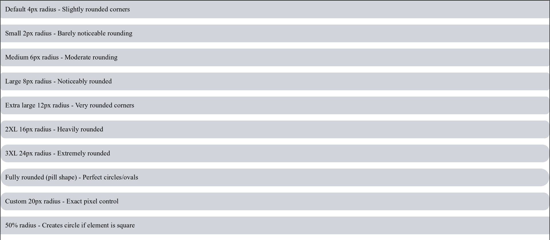
Border radius creates rounded corners. The value represents the radius of the circle used to round the corner:
<!-- Preset sizes with pixel equivalents -->
<div style="rounded bg-gray-300 p-4">Default 4px radius - Slightly rounded corners</div>
<div style="rounded-sm bg-gray-300 p-4">Small 2px radius - Barely noticeable rounding</div>
<div style="rounded-md bg-gray-300 p-4">Medium 6px radius - Moderate rounding</div>
<div style="rounded-lg bg-gray-300 p-4">Large 8px radius - Noticeably rounded</div>
<div style="rounded-xl bg-gray-300 p-4">Extra large 12px radius - Very rounded corners</div>
<div style="rounded-2xl bg-gray-300 p-4">2XL 16px radius - Heavily rounded</div>
<div style="rounded-3xl bg-gray-300 p-4">3XL 24px radius - Extremely rounded</div>
<div style="rounded-full bg-gray-300 p-4">Fully rounded (pill shape) - Perfect circles/ovals</div>

<!-- Custom radius values -->
<div style="rounded-[20px] bg-gray-300 p-4">Custom 20px radius - Exact pixel control</div>
<div style="rounded-[50%] bg-gray-300 p-4">50% radius - Creates circle if element is square</div>
Border System
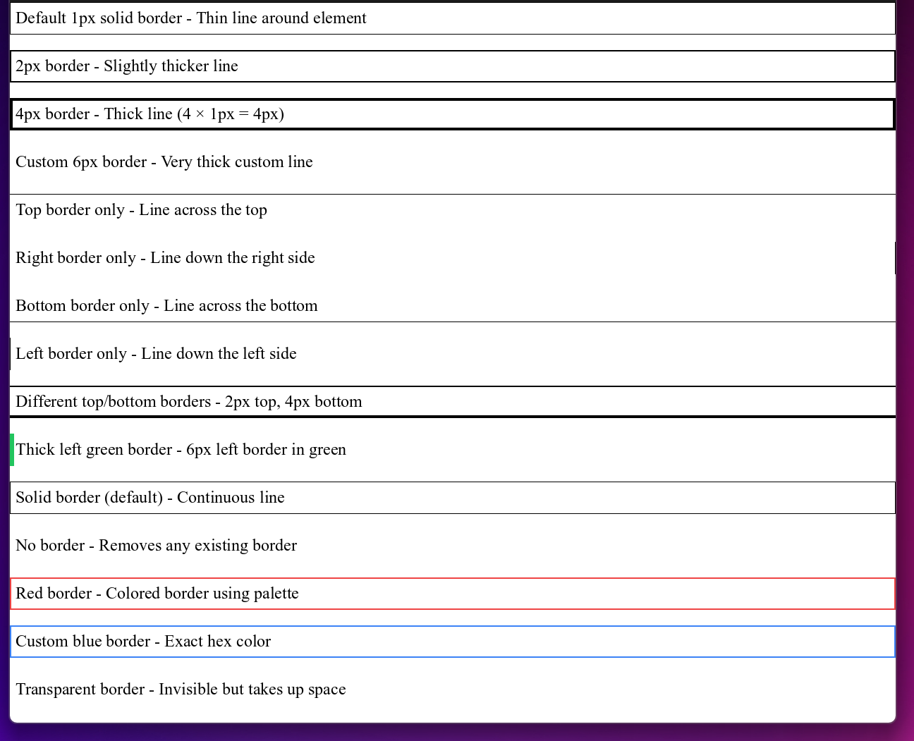
Borders create visible lines around elements. You control thickness, style, and color:
<!-- Border thickness (width) -->
<div style="border p-2">Default 1px solid border - Thin line around element</div>
<div style="border-2 p-2">2px border - Slightly thicker line</div>
<div style="border-4 p-2">4px border - Thick line (4 × 1px = 4px)</div>
<div style="border-[6px] p-2">Custom 6px border - Very thick custom line</div>

<!-- Border on specific sides only -->
<div style="border-t p-2">Top border only - Line across the top</div>
<div style="border-r p-2">Right border only - Line down the right side</div>
<div style="border-b p-2">Bottom border only - Line across the bottom</div>
<div style="border-l p-2">Left border only - Line down the left side</div>

<!-- Combined sides with different thicknesses -->
<div style="border-t-2 border-b-4 p-2">Different top/bottom borders - 2px top, 4px bottom</div>
<div style="border-l-6 border-green-500 p-2">Thick left green border - 6px left border in green</div>

<!-- Border styles (appearance) -->
<div style="border border-solid p-2">Solid border (default) - Continuous line</div>
<div style="border-none p-2">No border - Removes any existing border</div>

<!-- Border colors -->
<div style="border-2 border-red-500 p-2">Red border - Colored border using palette</div>
<div style="border-2 border-[#3b82f6] p-2">Custom blue border - Exact hex color</div>
<div style="border border-transparent p-2">Transparent border - Invisible but takes up space</div>
Interactive States
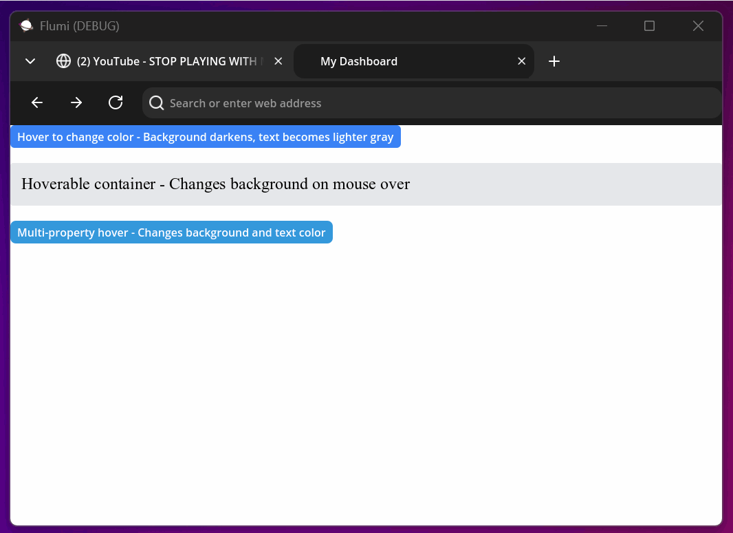
Hover States Explained
Hover states trigger when a user moves their mouse cursor over an element. Use them to provide visual feedback:
<button style="bg-blue-500 text-white px-4 py-2 hover:bg-blue-600 hover:text-gray-100">
    Hover to change color - Background darkens, text becomes lighter gray
</button>

<div style="bg-gray-200 p-4 rounded hover:bg-gray-300">
    Hoverable container - Changes background on mouse over
</div>

<!-- Complex hover effects with multiple property changes -->
<button style="bg-[#3498db] text-white rounded-lg hover:bg-[#2980b9] hover:text-[#f8f9fa]">
    Multi-property hover - Changes background and text color
</button>
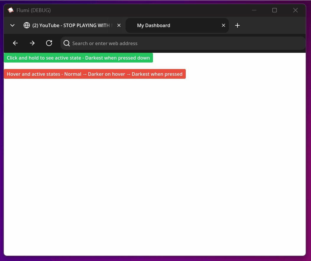
Active States Explained
Active states trigger when an element is pressed/clicked and held. They provide immediate feedback for user interaction:
<button style="bg-green-500 text-white px-4 py-2 rounded
               hover:bg-green-600
               active:bg-green-700 active:text-gray-100">
    Click and hold to see active state - Darkest when pressed down
</button>

<!-- Combined states create smooth interaction flow -->
<button style="bg-[#e74c3c] text-white px-4 py-2 rounded
               hover:bg-[#c0392b] hover:text-[#ffffff]
               active:bg-[#a93226] active:text-[#ecf0f1]">
    Hover and active states - Normal → Darker on hover → Darkest when pressed
</button>
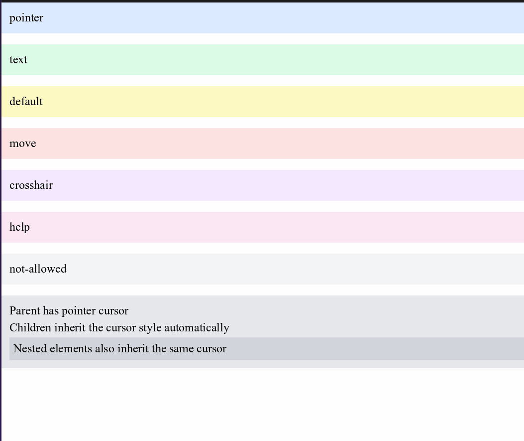
Cursor Control
Control what mouse cursor appears when hovering over elements:
<div style="cursor-pointer p-4 bg-blue-100">pointer</div>
<div style="cursor-text p-4 bg-green-100">text</div>
<div style="cursor-default p-4 bg-yellow-100">default</div>
<div style="cursor-move p-4 bg-red-100">move</div>
<div style="cursor-crosshair p-4 bg-purple-100">crosshair</div>
<div style="cursor-help p-4 bg-pink-100">help</div>
<div style="cursor-not-allowed p-4 bg-gray-100">not-allowed</div>

<!-- Cursor inheritance flows down to child elements -->
<div style="cursor-pointer bg-gray-200 p-4">
    <p>Parent has pointer cursor</p>
    <p>Children inherit the cursor style automatically</p>
    <div style="bg-gray-300 p-2">
        <p>Nested elements also inherit the same cursor</p>
    </div>
</div>
Advanced CSS Features
Opacity & Z-Index
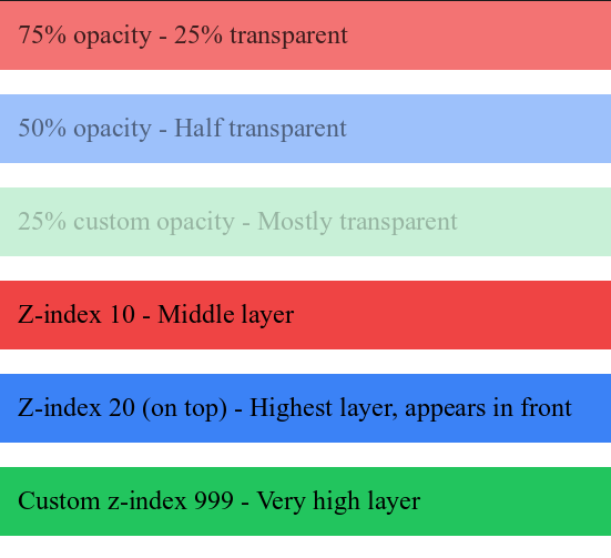
- Opacity controls transparency (0 = invisible, 1 = fully visible)
- Z-index controls stacking order (higher numbers appear in front)
- Think of it as layers of paper: higher z-index means the paper is on top of others
<div style="opacity-75 bg-red-500 text-white p-4">75% opacity - 25% transparent</div>
<div style="opacity-50 bg-blue-500 text-white p-4">50% opacity - Half transparent</div>
<div style="opacity-[0.25] bg-green-500 text-white p-4">25% custom opacity - Mostly transparent</div>

<!-- Z-index stacking (only works with stacking elements) -->
<div style="z-10 bg-red-500 p-4">Z-index 10 - Middle layer</div>
<div style="z-20 bg-blue-500 p-4">Z-index 20 (on top) - Highest layer, appears in front</div>
<div style="z-[999] bg-green-500 p-4">Custom z-index 999 - Very high layer</div>
</div>
CSS Selectors
Advanced selector support for complex styling based on element relationships:
<head>
    <style>
        /* Descendant selectors - Apply to nested elements */
        div p { text-[#663399] }  /* All paragraphs inside any div */
        .container span { bg-[#ffeeaa] }  /* All spans inside elements with 'container' class */

        /* Direct child selectors - Apply only to immediate children */
        .outer > p { font-bold }  /* Only paragraphs directly inside .outer */
        .parent > button { bg-[#44cc88] }  /* Only buttons directly inside .parent */

        /* Adjacent sibling selectors - Apply to next sibling */
        h1 + p { text-[#ff0000] font-bold }  /* Paragraph immediately after h1 */
        h2 + div { bg-[#eeffee] }  /* Div immediately after h2 */

        /* General sibling selectors - Apply to all following siblings */
        h1 ~ p { text-[#0000ff] }  /* All paragraphs after h1 (same parent) */
        h3 ~ span { bg-[#ffdddd] }  /* All spans after h3 (same parent) */

        /* Attribute selectors - Apply based on HTML attributes */
        input[type="text"] { border bg-[#f9f9f9] }  /* Text inputs only */
        a[href^="https"] { text-[#008000] font-bold }  /* Links starting with https */
        button[disabled] { bg-[#888888] text-[#cccccc] }  /* Disabled buttons */
        input[placeholder*="email"] { border-2 border-[#0066cc] }  /* Inputs with 'email' in placeholder */
        div[style$="special"] { bg-[#ffffaa] }  /* Divs with style ending in 'special' */

        /* Pseudo-class selectors - Apply based on element state */
        button:hover { bg-[#2563eb] }  /* Buttons when hovered */
        input:focus { border-blue-500 }  /* Inputs when focused/selected */
        li:first-child { font-bold }  /* First list item */
        li:last-child { text-red-500 }  /* Last list item */
    </style>
</head>
Class-Based Styling
Define reusable style classes for consistent design:
<head>
    <style>
        .card { bg-[#1e293b] text-white rounded-xl p-4 shadow-lg }
        .btn-primary { bg-[#3b82f6] text-white px-4 py-2 rounded hover:bg-[#2563eb] }
        .btn-success { bg-[#10b981] text-white px-4 py-2 rounded hover:bg-[#059669] }
    </style>
</head>

<body>
    <div class="card">
        <h2>Card Title</h2>
        <p>Card content</p>
        <button style="btn-primary">Primary Action</button>
        <button style="btn-success z-10">Success Action</button>
    </div>
</body>
Classes are defined inside style attribute alongside inline styles, unlike traditional CSS where they are defined in a separate class attribute.
Default Styles
Gurted provides sensible default styling for all HTML elements so they look good without any custom CSS:
/* Text elements with their default sizes */
body { text-base text-[#000000] text-left }  /* 16px black left-aligned text */
h1 { text-5xl font-bold }  /* 48px bold heading */
h2 { text-4xl font-bold }  /* 36px bold heading */
h3 { text-3xl font-bold }  /* 30px bold heading */
h4 { text-2xl font-bold }  /* 24px bold heading */
h5 { text-xl font-bold }   /* 20px bold heading */
h6 { text-base font-bold } /* 16px bold heading */

/* Text formatting elements */
b { font-bold }      /* Bold text */
i { font-italic }    /* Italic text */
u { underline }      /* Underlined text */
small { text-sm }    /* Small text (14px) */
mark { bg-[#FFFF00] }  /* Highlighted text with yellow background */
code { text-base font-mono }  /* Code text in monospace font */
pre { text-base font-mono }   /* Preformatted text in monospace */

/* Interactive elements */
a { text-[#1a0dab] }  /* Links in traditional blue color */

/* Button styling */
button { bg-[#1b1b1b] rounded-md text-white hover:bg-[#2a2a2a] active:bg-[#101010] }
button[disabled] { bg-[#666666] text-[#999999] cursor-not-allowed }
Complete Examples
Button Variations
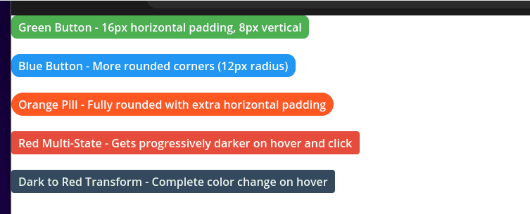
<!-- Basic styled buttons with different colors and shapes -->
<button style="bg-[#4CAF50] rounded-lg text-white px-4 py-2">Green Button - 16px horizontal padding, 8px vertical</button>
<button style="bg-[#2196F3] rounded-xl text-white px-4 py-2">Blue Button - More rounded corners (12px radius)</button>
<button style="bg-[#FF5722] rounded-full text-white px-6 py-2">Orange Pill - Fully rounded with extra horizontal padding</button>

<!-- Multi-state buttons that change on interaction -->
<button style="bg-[#e74c3c] text-white rounded hover:bg-[#c0392b] active:bg-[#a93226]">
    Red Multi-State - Gets progressively darker on hover and click
</button>

<!-- Complex hover effects with dramatic changes -->
<button style="bg-[#34495e] text-[#ecf0f1] rounded
               hover:bg-[#e74c3c] hover:text-white">
    Dark to Red Transform - Complete color change on hover
</button>
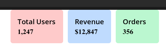
Dashboard Grid with Responsive Layout
<div style="flex flex-wrap gap-4 p-4">
    <!-- Revenue cards that wrap on smaller screens -->
    <div style="flex-1 min-w-64 text-white p-6 rounded-lg">
        <h3 style="text-xl font-semibold mb-2">Total Users</h3>
        <p style="text-3xl font-bold">1,247</p>
    </div>

    <div style="flex-1 min-w-64 bg-gradient-to-r from-green-500 to-teal-600
               text-white p-6 rounded-lg">
        <h3 style="text-xl font-semibold mb-2">Revenue</h3>
        <p style="text-3xl font-bold">$12,847</p>
    </div>

    <div style="flex-1 min-w-64 bg-gradient-to-r from-yellow-500 to-orange-600
               text-white p-6 rounded-lg">
        <h3 style="text-xl font-semibold mb-2">Orders</h3>
        <p style="text-3xl font-bold">356</p>
    </div>
</div>
The CSS system in Gurted provides powerful styling capabilities while maintaining the familiar utility-first approach, all rendered with native performance through the Godot engine.